
August 14, 2026
A PowerPoint presentation that communicates well and leaves your key points lingering in the mind of the audience comes down to two things—good content and good graphic design. But this doesn't mean you must be a gifted writer or skilled designer to build a successful presentation.
Keep in mind: a PowerPoint presentation is meant to be a presentation aid—not the presentation itself.
Simple, easy-to-follow best practices for document setup, layout and design, and content formatting can help you create a digital presentation that augments a confident oral presentation, building trust and making a listener delight, not struggle, to pay attention.
1. Determine an aspect ratio
The 16:9 aspect ratio has quickly become the standard for PowerPoint presentations. In most cases, this is the best aspect ratio to use to maximize the visual impact of your presentation, ensuring it fills the screen of most displays.
Some conference venues utilize wider projection or LED displays with aspect ratios of 2:1 or 21:9. If the presentation is for a specific venue, ask for the display resolution so you can match your document size. Presentations always look best when they appear designed for the display on which they are shown.
If your presentation must be readable on various display sizes and devices, and/or printed out, you might consider a 4:3 aspect ratio. This ratio prints very nicely on a standard U.S. letter paper. The 4:3 aspect ratio might prove useful to you if you are distributing a presentation to a sales team using a plethora of devices to present to customers.

Consider creating two presentations at different aspect ratios, or a print-only version, to be most prepared.
Changing the aspect ratio of your presentation is done by selecting Slide Size (and Page Setup on Mac). If you need a custom size/ratio, enter a number followed by "px"—PowerPoint will automatically convert it to inches.
2. KISS—“Keep It Simple, Stupid”
"Good advice; hurts my feelings every time."
Slide presentations should be creative but not cluttered. Use the main speaking points as short, concise statements, formatted as single lines or a bulleted list. Keep design elements to a minimum so as not to distract the audience from what the speaker is actually verbally presenting.
If you're the presenter, focus on your content and delivery so you don't need to rely on your presentation for cues. This will help you move toward less slide content and it will make your presentation better—regardless of how your slides look.
If you're building a PowerPoint for another presenter, read through the content and make suggestions for key points to display on the slides. It's often helpful to give them what they asked for first, then provide some options showing simplified slide content.
When in doubt, "less is more."

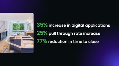
These slides are visually compelling, simple and effectively emphasize the key talking points.
3. Use readable and consistent fonts
Guy Kawasaki suggests nothing under 30 point—however, use a consistent font size even if it is a little smaller to present a consistent, appealing presentation.
Here are some guidelines we recommend:
Font Family: Arial, Calibri
Headlines: 36–60 pt
Body: 20–30 pt
Avoid font sizes below 20 pt, which will be difficult to read from a room display. Virtual screen sharing may be more forgiving if you have a high-bandwidth, stable connection. With a spotty connection, font sizes below 20 pt will begin to pixellate.
Set up a font size hierarchy and follow it. If your headlines are 40 pt and your body text is 24 pt, ensure that you use those sizes throughout your presentation, with minimal exceptions.
Avoid non-default fonts unless you have strict control over all the devices involved in editing and presenting your PowerPoint presentation. Use Arial or Calibri as worry-free options. Powerpoint has a feature to embed used fonts in the document but, in our experience, it can be buggy.
Whatever fonts you use will have to be installed on every computer that opens your PowerPoint. That could mean an entire sales team, various production company and/or venue devices, as well as anyone who edits the document. An individual editing your PowerPoint without your specified font may result in a default font being saved in its place.
4. Use Slide Master to standardize templates
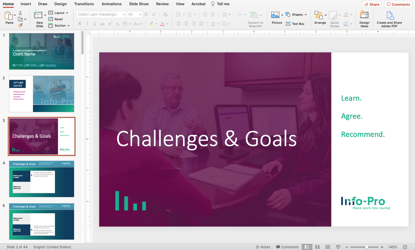
With master slides, you can set up a custom appearance for your presentation so when slides are added in Normal view, backgrounds, colors and font styles won't have to be reformatted.
Define your styles once with master slides, then build out your presentation's content.
Master slides are intended to ensure consistency when building a presentation, and a great way for organizations to maintain brand appearance. The sub slides in Slide Master (called Layouts) allow for different layout options—adjust the placement of headers, subheads, images and bulleted text.
If you're building a presentation template, consider creating master slides with a variety of layout options to give your team multiple "on-brand" options for their presentations.
Master slides also allow you to add objects that will not be editable from the Normal view. To add non-editable content in Slide Master, use tools in the Home or Insert tabs to add images, text and more. That content will become part of the background and not editable in Normal view.
All existing text and media placeholders on master slide layouts are editable in Normal view. To add your own editable content, you must use Insert Placeholder instead of a regular text box or image.
5. Don’t overuse animations
At best, animations are eye candy, adding little value to meaningful content. When they aren't timed out well, animations cause distraction, even enough to completely disrupt the flow of a speaker and the attention of the audience. Animations may also cause unpredictable results when displayed across different devices (for example, different operating systems).
Stick with simple slide transitions and only animate objects if it truly helps communicate an idea or concept.
Let your verbal presentation impress your audience. Use the PowerPoint presentation to support what you're saying. Keep it short, to the point and easy on the eyes—your audience’s time is valuable.
For tips on developing business presentation content, see this blog post.
Struggling to make your presentations stand out? Learn about PowerPoint's newest features and how they can help make your presentations more engaging.