Smart Ways to Revamp Your Manufacturing Website
June 17, 2025
 It’s no big shock—manufacturers aren’t known for dazzling websites. But why not? Unlike e-commerce sites, sales conversions typically don’t happen directly on a manufacturing site. Much more focus is put into traditional sales, advertising and shows. But in today's world, prospects will most likely learn about your company first through your website, through search or a direct visit. Does your website accurately reflect your unique selling proposition and benefits? You have just a few seconds to make them stay.
Interesting fact—your company's credibility is based on the design of your website, 75 percent of the time. It's the first thing most prospects review to learn more about you, and it will be their reference as they move down the sales funnel. Their perspective will be shaped largely by how well your site portrays your brand, quality and service. And nothing hurts a company’s brand image more than a poorly designed, dated website.
Here are some of our thoughts on how manufacturers can take their online presence from dull to dynamic.
Grab attention with striking photography.
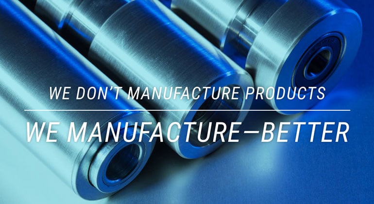
It’s safe to say the average manufactured component lacks visual appeal. Or is it? Could it simply require a new look at that average component?
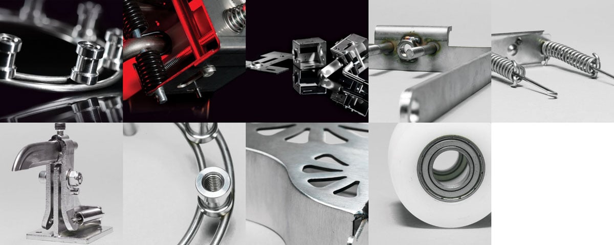
Photography can take mechanical, emotionless products and make them curious and abstract. Shoot from unexpected angles. Show details with extreme close-ups. Reflective or textured surfaces enhance appearances. Take a viewer through the stages of production. Each stage is an opportunity to visually represent problem-solving expertise.
Here are a few examples of how we used these photographic techniques to create a compelling gallery for Wisconsin Stamping & Manufacturing.
Showing pictures of your team and your working environment are just as important. Convey your culture with photos of your team and facility to connect with your audience on a deeper level. While it's a great tool for recruiting employees, clients who understand your corporate culture see something more—employee longevity which means understanding, quality and consistency. Let users tour the facility through a series of images, whether that's showcasing a clean warehouse, engineering and lab facilities, and committed team members.
Take time to communicate with compelling messages.
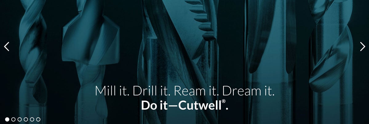
It's easy to be bold about a new car, an energy drink or an ultra-light athletic shoe. It's trickier positioning medical tubing, cutting tools and metal stampings.
When it comes to writing copy for headlines and home page sliders, think creatively. What value do your products and processes bring to the table? Pique interest and curiosity with thought-provoking facts and smarter ways to say it.


Keep the design clean with a simple navigation.
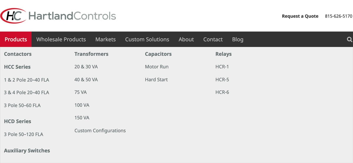
A manufacturer’s website is still a frequent conversion point even though nothing's sold online. Customers and prospects seek answers to specific questions, and if it’s too hard to find what they want to know, they leave and try somewhere else. Think about what your website is saying about your business. A clean, organized site with simple navigation is an effective spokesperson for your brand.
Your main navigation should be based on your site goals. If you have a large variety of product lines and want pages for all of your products with descriptions, a mega menu is a smart strategy. Here’s one created for the “Products” section for Hartland Controls. If a customer is looking for a specific product, why not introduce them to more?
If you don’t need a deep site, a single-page site with anchor navigation is a great way to simplify. By clicking an anchor link you direct your viewer to the exact location on the page. We did exactly that for Wisconsin Green.
Encourage interaction with clear CTAs and goals.
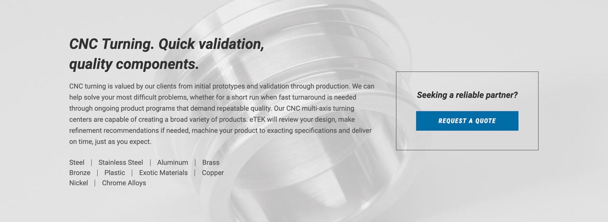
Why do prospects and current customers come to your site? For what exactly are they searching? Identify that and put it front and center with a call to action (CTA). Is it to request a quote? Are they trying to view and learn more about your products? Whatever it is, that should be the chief goal of your website. For those who simply want to learn more about your company or history, a robust “About” section is a must.
Following these tips will ensure your brand doesn’t suffer from a poorly designed site. If you're known for innovation, quality, and exceptional service, let your site reflect exactly who you are.


