January 27, 2025
 We’ve seen them before. And have felt the frustration. Whether having to close a popup before viewing a page or being bombarded with multiple ones as you scroll through an article. But every once in a while, an offer truly catches your eye. A timely discount, an important reminder or a helpful suggestion.
So what separates a good pop-up form from the rest? And how do you know if they are hurting or helping your website? Here are several considerations and best practices to help ensure your forms are useful and provide true value.
What does the data say?
A G2 study asked what people dislike most about popups and the top response was “They’re everywhere.” An astounding 73% of people also stated there is nothing that could convince them to leave their email address in a popup—meaning they annoy the majority of visitors no matter the offer. While this data initially leads you to think pop-up forms should be abandoned altogether, it’s important to note 27% of users did say they would submit their email address under the right conditions.
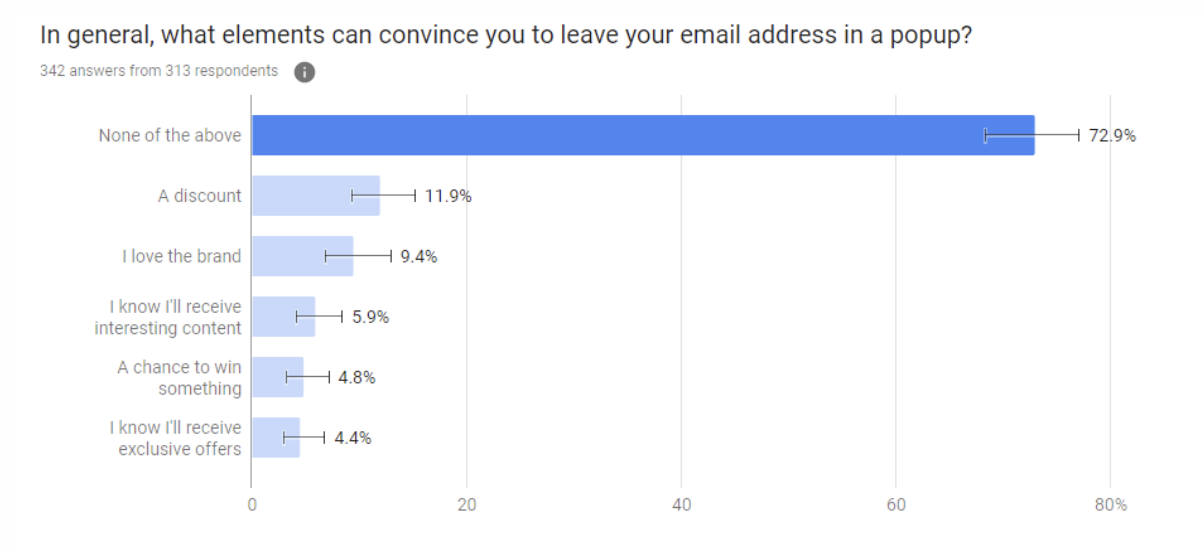
Source: G2
A good conclusion to draw is this—since pop-up forms annoy users more often than not, they should be used sparingly and absolutely must provide genuine value. To optimize for conversion, there are three key considerations: relevancy, trigger and format.
Providing a relevant offer.
Irrelevancy is the main reason pop-up forms annoy visitors. Why are people coming to your page in the first place—what are they expecting? If the offer doesn’t align with those expectations and the content on that specific page, it will hinder rather than enhance the experience.
For example, if a popup to subscribe to your blog or newsletter appears on a product page, that will distract users from what they should want to be focusing on—learning more about your product. Off-topic messages are largely why popups have such a bad conversion rate across all industries.
Evaluate your conversion rate and calculate the ROI. Then you can determine if the value is worth upsetting the majority of your customers. The message also needs to be specific since 50% of people say having a clear indication of what they’ll receive is what draws them to complete the form.
Timing matters.
Popups that appear right away will almost always frustrate visitors—they are coming to your page for a specific reason and now can’t complete that task without an added barrier. Think about it. Are there sites you regularly visit, anticipating the need to close their pop-up form before you can access anything on the site? Or maybe you enter a page and are bombarded with a pop-up form, cookie notice, pop-up chatbot and more. With so many obstructions to viewing the content, users are discouraged to stick around, especially on mobile. A better option would be triggering a popup just before they leave your website.
Here’s a quick overview of different pop-up form triggers:
- Element Interaction: Appears when a visitor clicks on or hovers over a specific element. These are more effective than other popups since the user is showing interest in learning more about certain content.
- Time on Page: Appears after the visitor has been on the page for a set amount of time.
- Exit Intent: In an effort to capture a visitor’s attention before they leave, these popups can be triggered when a user’s cursor moves out of the upper page boundary, such as the tabs or “X” area. On mobile, triggers could be pressing the back button or a time-based scroll.
- Inactivity: Appears if the user has not taken action on the page in a while.
- Page Scroll: Appears when the visitor scrolls to a certain point. These can be used as an alternative to embedding CTAs in long-form content. Don’t have multiple scroll triggers, however. If viewers weren’t interested the first time, having to close offers continually while scrolling frustrates users and increases bounce rate.
- Page Entrance: Appears the moment a visitor enters the page. Widely considered by users as annoying and disruptive, use this only with less-intrusive formats such as top banner instead of full-page.
How to optimize different formats.
It’s crucial to pair content with the right trigger and format. In each category, here are examples of how a pop-up form can be used effectively.
Full-page popup.
Only use this format if it’s an exceptional offer, relevant to the majority of people visiting a certain page. These should not be used year-round, or on every page. For example, if it's a 20% off Labor Day sale, that likely holds value for most users visiting your site during that time.
Careful design must go into this format as well. Some users may accidentally close the page instead of closing the popup. In addition to having the exit “X” in the corner, include a text or button option for closing the popup, reducing confusion and bounce rate.
Small slide-ins or overlay modals.
These are less intrusive than full-page. Slide-ins can appear from the side or bottom of the page and are often triggered on page scroll. Overlay modals appear in the center of the screen on top of the page. While they don’t block the full page, they significantly interrupt the user experience so the message must be very compelling.
Good examples of small popups could include an eBook offer on a blog post that provides more insights about the topic, or a relevant discount on a product page.
As an alternative for full-page popups and overlay modals, consider a prominent banner to display important offers. This type of execution can be just as effective in catching the users interest without disrupting their user experience.
Banner bars.
Banner popups appear as a bar at the very top of a page. This is typically the most user-friendly format and should be your default. Use banner popups only on relevant pages, unless it’s critical news all of your visitors should know, such as a company acquisition or a change to your product or service. Consider using banners to announce a new product, or promote an upcoming event or limited-time offer.
Banners also shouldn’t be sticky bars, since that ruins the mobile experience. In general, it’s best practice to disable popups for mobile since they take up too much screen space.
As you evaluate the usage of pop-up forms on your website, keep user experience in mind. If what you have to offer is truly worth the disruption, pop-up forms can be a handy campaign tool for generating leads.