April 7, 2026
A bad user experience (UX) is not simply a web design problem, but a revenue problem. Think about it. Do you have low engagement on key solution pages? Is your request-a-demo form often left unfinished? How many return visits does your site receive?
B2B buyers start evaluating solutions, credibility and risks online. Every vague message, confusing navigation, unclear form field or buried CTA introduces friction that stalls or kills opportunities. Prospects can quickly turn to competitors who make it easier to understand, evaluate and justify a purchase.
Here are five UX red flags that cause drop-offs and how to fix them.
1. Red Flag #1: Vague positioning and “we do everything” messaging.
A generic message, such as “We empower digital transformation,” could apply to anyone. Messaging like this is often a result of the company never creating an Ideal Customer Profile (ICP). Without clear positioning, viewers can’t tell if you truly understand their industry and challenges.
Trying to be everything to everyone creates a site that fails to become the authority on anything. Content won’t resonate with buyer pain points, and your brand can come across as a “generalist” with shallow expertise in niche and complex markets.
This results in attracting the wrong leads, lower conversion rates, and diluted SEO performance. And from a branding standpoint, you’ll have weakened differentiation and lose the ability to defend premium pricing because your unique value is unclear.
How to fix it:
-
Develop a brand prism to identify what value propositions will resonate with your audience and lay the groundwork for your branding efforts.
-
Rewrite copy to make it easy for visitors to identify who your ideal buyer is, specific problems solved and measurable outcomes delivered.
-
Add an industries section if you serve a broad range of markets to tailor messaging to each audience and show how your solution and expertise is relevant for their unique needs.
-
Add use cases to show how customers are using your solution to inspire prospects, establish credibility and prove tangible results.
-
Create resources such as a simple “We’re a fit if...” checklist, eBooks or whitepapers that offer a deep dive into more technical topics.
2. Red Flag #2: Conversion paths that assume visitors want a demo right now.
Most visitors aren’t ready for a sales conversation yet. They’re researching the problem, comparing approaches or building a business case. Having “Book a Demo” or “Contact Sales” as the primary conversion path leaves people who might buy in 3-12 months with nowhere to go. They remain anonymous instead of being nurtured and converted with lower-friction options—such as offering guides, webinars or a newsletter subscription.
A demo-or-nothing approach also has negative internal consequences. Sales teams get bogged down with calls from poorly qualified leads who just need basic questions answered.
Remember, a B2B deal involves multiple stakeholders—different personas need different levels of information at different times. Websites with conversion paths tailored for each funnel stage will almost always outperform ones that push everyone straight to a demo.
How to fix it:
-
Offer alternatives for early- and mid-funnel visitors, such as “View product tour,” “See sample report,” “Estimate ROI.”
-
Create low-friction options by offering a mix of ungated resources (e.g., blogs, short videos, checklists) and light gates (email only) for the more detailed guides, comparisons and playbooks.
-
Optimize your demo path to be valuable and not pushy. Clearly explain what the meeting will include, such as a walkthrough and tailored recommendations. Minimize the form fields, only requesting what’s needed to qualify. Long, intrusive forms increase abandonment.
3. Red Flag #3: Weak or generic social proof.
Generic social proof weakens your brand. When testimonials sound interchangeable, logos are outdated or irrelevant to your ICP, or case studies are thin on specifics, your claims will feel more like marketing copy than evidence. As a result, visitors hesitate to take the next step. The risk feels too high and the outcome uncertain.
In markets crowded with lookalike solutions, generic social proof turns what should be a powerful differentiator into background noise. Lacking credible proof also has downstream revenue consequences. Champions will have a harder time selling your solution internally without being able to point to strong metrics, use cases and recognizable peers.
How to fix it:
-
Prioritize stories for your ideal customer. Be intentional about who you feature and what is highlighted based on what matters most to your ICP.
-
Format your case studies to include the situation, challenge, solution and measurable results.
-
Tag case studies by industry, company size, and use case so each visitor can quickly find relevant content.
-
Use a mix of quick quotes, power stats, mini-stories and full case studies. Weave the social proof into key decision moments across your site, such as on the home page, next to forms and pricing sections, and on solution and industry pages.
4. Red Flag #4: Missing or buried implementation details.
Is “white-glove onboarding” mentioned once but never detailed? Remember, one of the biggest questions a B2B buyer has is “how do we actually get this live?” Addressing that question vaguely—or not at all—will create a high-risk perception and increase friction in the buying process. Without an idea of how disruptive the change will be, what resources will be needed, and how long it will take to get value, you lose a major opportunity to differentiate.
Sales cycles get longer and more expensive when reps have to answer the same basic implementation questions 1:1, and internal stakeholders raise objections late in the process instead of being reassured early.
A well-structured implementation and onboarding experience should be a core part of your offer, not an afterthought. Use your site to help prospects self-qualify and set realistic expectations, so deals don’t stall down the road. After all, if a competitor clearly shows how they guide customers from contract to first value, they’ll be perceived as safer and more experienced—making it easy for champions to justify choosing them over you.
How to fix it:
-
Add an Implementation FAQ to your site that answers common rollout questions.
-
Create an Implementation Guide that is downloadable, offering visitors a deeper dive into details about the implementation phases, owners and timeline ranges. Include a sample onboarding plan and what’s expected from the customer.
-
Offer supporting resources such as onboarding best practices, an implementation-focused case study or a short video walkthrough.
-
Include a low-friction CTA on key product pages such as “Talk to us about rollout” or “Ask an onboarding specialist.”
5. Red Flag #5: A slow, cluttered or mobile-unfriendly experience.
Long load times, glitchy videos, tables that break on mobile and confusing navigation are immediate red flags for today’s digital-savvy buyer. Your brand will appear outdated and careless, eroding trust in your product’s quality.
Slow pages drive up bounce rates, shorten sessions and reduce the likelihood of visitors filling out forms or requesting demos, directly hurting conversion rates and lead generation. Especially on mobile, viewers simply tap back to find a faster alternative, so you could lose prospects before they ever see your value proposition. Search engines also downgrade pages that aren’t responsive or that have missing/incorrect mobile tags, further reducing organic traffic.
How to fix it:
-
Improve page speed with simple fixes such as image compression and script cleanup. Avoid large animations on key pages and disable autoplay video.
-
Simplify navigation and layout to ensure top-level content is grouped logically, section headings are clear and CTAs aren’t competing or hidden.
-
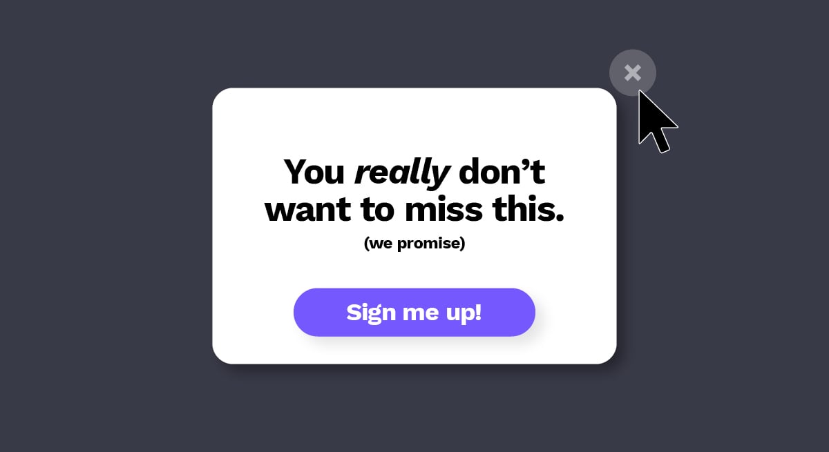
Clean up forms and pop-ups, shortening forms to only essential fields for the first conversation and minimizing or removing pop-ups on mobile.
Start prioritizing a handful of high-impact changes.
UX red flags kill both your pipeline and brand trust. The good news is that every issue in this list can be fixed with focused, incremental work. Start by auditing your site through the lens of a first-time visitor. Can they tell who you serve and what you do? Do they have more than one reasonable next step? Can they see proof and a clear path to going live?
Treating UX as an ongoing revenue program—and not a one-off project—enables your website to start acting like the sales asset it’s meant to be. Want a quick, complementary UX audit of your site?