December 13, 2018
![]()
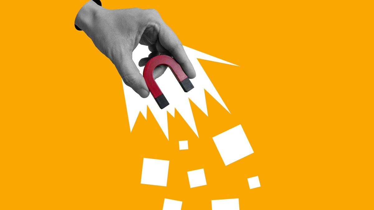
Eye-tracking technology is increasing in popularity within the marketing and advertising fields, largely used in studies to improve digital signage, product package designs and most often, websites. By tracking visitors visual path across a site, valuable insights are gained into what content is ignored and what areas grab the most attention. Eye-tracking studies have also found many similarities in user behavior, providing fascinating insights that can help you optimize web design and maximize your content’s effectiveness.
Here’s 6 user trends eye-tracking technology has revealed.
1. Content at the top receives the most attention.
Did you know 80% of visitors time is spent above the fold? While this likely is not too surprising, it’s a good reminder to keep your main messaging within that area since their attention span will greatly decrease as they scroll down. However, eye-tracking heat maps have also found that their attention increases again when they reach the bottom of the page. For long web pages, use color contrast wisely to make sure the layout promotes scrolling and take advantage of viewers regained attention at the bottom with a clear call-to-action.
2. Attractive web design can override consumer preferences.
A neurological study done by Caltech has shown that when people are in a rush to make a purchase or are distracted by similar-looking products, they tend to think less about their personal preferences and instead choose the most visually appealing option. Simply put, what stands out visually is what’s chosen in a hurry. This has been found to be especially applicable with online purchases. Attractive sites that are optimized so visitors can find what they need as fast as possible greatly increase their likelihood of making the sale.
3. People have developed right-side “banner blindness.”
The left side of a website is typically looked at first and receives the heaviest attention throughout, as people read content in an F-shaped pattern. And since the right side is typically where most websites place their ads, users have become accustomed to that, leading to right-side “banner blindness”. This means they consciously or subconsciously ignore any ads or even banners that look like ads, particularly those placed on the right.
4. Having “real people” in images matter.
Eye-tracking heat maps show images with people attract the most attention. However they’ve also shown that viewers easily recognize when people images are stock, and quickly overlook them. This shows the importance of using authentic people in your photos, besides building trust. Studies have also found that it matters where the model is looking because the viewers eyes will follow. For example, if you have a person on an ad, make sure they’re looking at your product so the viewer’s attention doesn’t just focus on the person.
5. Newsletters are “read” in less than a minute.
An eye-tracking study done by the Nielson Group found that users spend on average only 51 seconds reading a newsletter, and most of that time is actually spent scanning—with only the title and headlines fully read. Furthermore, a whopping 67% of people completely skipped the introduction. This not only reiterates the importance to outline content and make it as short and concise as possible, but to pay attention to email headlines as well. Readers want to get to the point right away, so it’s better to keep headlines short and clear, staying away from creative headlines that seem mysterious and may be mistaken for spam.