A List of Unique CTA Ideas to Help Your Messages Stand Out

March 16, 2021

Learn more. Sign up. Contact us. It seems just about every website you visit has those same call-to-actions. And while effective and simply necessary in some instances, those words can be easy to gloss over since they don’t exactly command attention or compel you to act.
Customers connect to brands that have a personality—from warm and inviting to daring and bold. Every word, color and shape on your website and digital communications plays a role in shaping your brand personality—one that actively engages users or passively sits back. The purpose of a CTA is to invite your viewer to take a specific action, each button guiding them down a path to conversion.
Don’t let a great story fall flat—a CTA is your final, last-call to convince the reader to click-through and convert.
What makes a compelling CTA
A call-to-action button should always give the user a clear understanding of what will happen when they click it so there’s no confusion. The last thing you want to do is discourage users and lose trust by not following through on the promise. Focus on one goal and keep it short and sweet. Take into account how it will be viewed as well, as that helps determine length—a longer CTA may be okay if it’s a bigger button with more screen real estate.
Color, appearance and responsive design are just as important for making a CTA prominent and ensuring proper placement on any device. Use contrasting colors and white space to draw the eye towards it. Users will quickly associate that color with action, so throughout your website all CTAs should feature the same color and design for a consistent user experience.
Here’s an array of action words and examples grouped into common CTA categories to help fuel your creative thinking.
Learn more
- Explore
- Dive in
- Dig deeper
- Find out more
- Discover
- Compare
- Continue
- View details
- Show me how
- Get the full story

With warm and friendly messaging, Capital Data welcomes site visitors to learn what makes their approach different.
Video
- Watch now
- See it at work
- View the difference
- See why
- Check it out
- Take a look
- View now

Featuring a distinct play icon to indicate video, these CTAs on the Cortland Company home page are descriptive yet unique, encouraging viewers to see what makes synthetic fiber better than steel.
Content offer
- Get my...
- Download free…
- Claim your...
- Download now
- Get insights now

Ultra Consultants provides a clear call to action that sends users to a landing page to download the report.
Sign up
- Subscribe
- Join now
- Try for free
- Send me specials
- Get started
- Register now
- Reserve your spot
- Get updates

With concise, time-sensitive messaging and a color that stands out, the call to register in this Diversatek Healthcare email blast is evident.
Contact
- Let’s talk
- Tell me more
- Connect with us
- Talk to us
- Reach out
- Send us a note
- Get in touch
- What can we do for you?

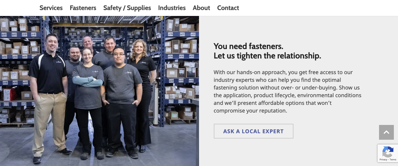
WorldSource Fasteners warmly invites viewers to contact their team for local expertise.
Donate
- Donate now
- Make a difference
- Change a life
- Give today
- Get involved
- Take action

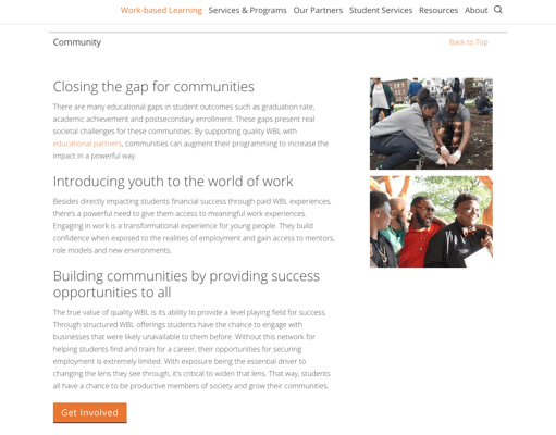
GPS Education Partners encourages viewers to learn how they can get involved.
While these are general examples, always make the CTA specific to your content. By being creative but still clear, you can pique more interest and ensure your brand character shines through at every touchpoint.


