October 26, 2026
While your brand logo, color palette, user experience, and art direction all contribute to your B2B brand's visual identity, perhaps none are as closely tied to the actual message you're communicating as typography. Think about it: how many words do you think you read in a day? Our world is covered in them, our favorite devices overflowing with them—you're reading them now. Choosing fonts to represent a B2B brand without a clear plan or simple understanding of typographic principles can be exhausting. Thankfully, defining your brand beforehand and knowing how to describe what you like are more than half the battle. We can help with the rest.
Considering typefaces, some attributes may be considered global—they separate well-designed typefaces from those that should be avoided. Others are more contextual and tonal, informing when and where certain fonts tend to work best. Even a brief survey of these characteristics will help you understand what you should be looking for when you evaluate typefaces and may even explain gut feelings about type you didn't know how to articulate.
Legibility and readability
Legibility and readability both describe visual comprehension, and though they are related, they have distinct meanings. Legibility refers to the ability to distinguish individual characters, or intelligibility at the word-by-word level. If you're looking at a word and you can't tell if a letter is an “o” or an “a,” that's a legibility issue.
A number of factors affect legibility, but size is the foremost. Generally speaking, larger type is easier to read. Fine details in letterforms, strokes that vary from thick to thin, ultra-thin or ultra-heavy font weights—all of these factors create ambiguity in letterforms, which is much easier for your brain to sort out when the text is large. Therefore, the smaller the type gets, the less ambiguity is tolerable.
Have you ever seen a font marked “Display” or “Text”? This indicates that the font was designed to have more legibility at smaller sizes (text) or more personality at larger sizes (display).
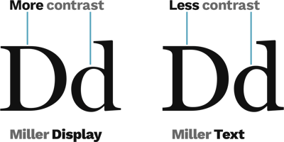
Fonts marked “Display” will usually have more variation from thick to thin (contrast) than those marked “Text.”
Rather than individual characters, readability refers to the ease with which a viewer navigates a block of text, like a paragraph. Because people typically read in chunks rather than word by word, different challenges affect readability. For example, line height, or the vertical space between lines of text, can have a large impact on readability (whether it's too large or small). A font’s x-height, the height of a lowercase letter in relation to a capital letter, also directly affects readability. Below-average x-height tends to be less readable. Letter spacing that is too tight decreases readability, as does a typeface with too much contrast.
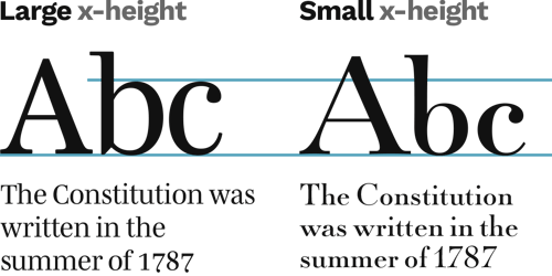
Note how x-height impacts readability and the overall feel of the text
For these reasons, it is not uncommon to choose one font for headline use and another for body text. Selecting a typeface only for headline use lets you focus on legibility while retaining unique character. A complementary body font that promotes readability completes the pairing, providing greater flexibility in brand communications.
You may be thinking, “Hasn’t the explosion of digital communication and media in our present age raised the bar to the point that most ‘default’ choices will easily satisfy this criterion?” Simply stated, yes. However, even with a plethora of well-designed fonts, the small differences that affect legibility and readability are big enough to make a difference in your brand appearance.

Try this yourself: pick out three similar headline fonts and three body fonts, assigning three pairs. Try to match them up so any given headline font “feels” best with its corresponding body font. Then, with the same headline and paragraph text, lay them out side-by-side. Virtually always one of those pairings will read better than the other two.
Exploring all the different tones and personalities that fonts can elicit makes it easy to forget about this core principle. Always keep the end user in mind and ask yourself, “Which option makes this content read best?”
Uniqueness and Familiarity: Trending Styles
Building on visual intelligibility, with the myriads of well-designed typefaces optimized for legibility, we should consider how to regard trending styles. Should you lean into trends or avoid them completely? How you answer should be partially informed by your brand personality and buyer personas. Do you want to be perceived as a disrupter, one that pushes the boundaries? How comfortable are you making other people uncomfortable? This is generally what new ideas do. Unlike consumer brands, B2B customers tend to require a much higher degree of trustworthiness and far less tolerance to risk. Unless your brand identity demands otherwise, you should seek typefaces with a balance of uniqueness and familiarity. Aiming for something that feels fresh, not foreign, is a good target.
Judging this is best accomplished by review with leadership and direct feedback from other professionals you trust, as well as the direction of experienced designers.
Briefly examining the past 20 years of web design, the relationship between typography trends and communications technology is easy to observe.
The early 2000s gave way to the popularity of sans-serif font styles. Serif fonts brought over from print design didn’t display well on low-resolution devices, so sans-serif type styles gained popularity. The proliferation of custom web fonts in the 2010s (e.g., Google Fonts was launched in 2010) led to widespread sans-serif domination—and their subsequent “blandification.” Later, as device display resolution improved, digital-first design gained broad adoption, and designers grew tired of the ubiquity of sans-serif styles, serif fonts began to have a revival of their own.
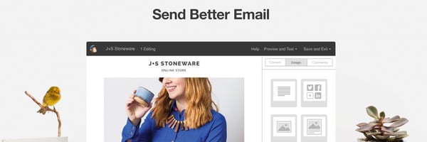

Check out the shift in typography on the MailChimp website from 2016 to 2026.
A design partner familiar with the history leading up to today’s trends can help you find the right balance of uniqueness and familiarity for your brand.
Conveying Your Brand Style
At least half the work of finding fonts that suit your brand comes from defining your brand itself. Your brand personality, audience, competitors—who are you and why should your customers choose you? If you haven’t yet, consider a Brand Prism exercise to discover, define, and document the foundational brand you intend to represent with typography.
Much of the remaining challenge is knowing how to describe what you’re looking for. Do you know someone who says, “I’ll know it when I see it”? Often this is due to the inability to sufficiently describe something, not indecision.
Here’s a brief survey of font styles and where they tend to be most effective.
Geometric Sans
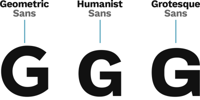
Sans-serif is a category of fonts that means “without serifs,” or the little “feet” that are present on a font like Times New Roman. Geometric sans-serif emphasizes accurate geometry and tends to have a technical precision at light to medium weights, though it can also be youthful at heavier weights.
Identifying Geometric Sans compared to other sans-serif fonts:
-
Letterforms that are closer to circles and squares rather than organic shapes
-
Sharper edges
-
Generally wider letters
-
Often a single-story lowercase “a”
-
Often a lowercase “g” without a loop
Example: Poppins
Humanist Sans
This sans-serif style was influenced by handwriting, so it has a more organic, connected look. Design details are often for legibility, borrowing relief cuts and pseudo-serifs from serif styles, and it is usually a good choice for body text.
Identifying Humanist Sans compared to other sans-serif fonts:
-
Letterforms that are more organic and elliptical
-
Sharper edges
-
Generally narrower letters
-
Often a two-story lowercase “a”
-
Often a lowercase “g” with a loop
Example: Lato
Grotesque/Neo-Grotesque Sans
For this article, we’ll discuss these together. The Grotesque sans-serif fonts are most notable for low contrast and even letter strokes and are often seen as the most neutral of the three. They can be geometric or organic, which makes them a bit more difficult to identify.
Identifying Grotesque/Neo-Grotesque Sans compared to other sans-serif fonts:
-
Letterforms that are geometric, organic, or rounded rectangular
-
Even letter strokes
-
Tend to feature the widest and most condensed variants
Example: Roboto
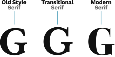
Old Style Serif
The first type style to deviate from the Blackletter (or Gothic) style that was popular in the 15th century, Old Style typefaces remain very readable, providing a classic, traditional appearance.
Identifying Old Style Serif compared to other serif fonts:
-
Letterforms that are mostly organic
-
Even letter strokes, diagonal stress
-
X-height on the smaller side
Example: EB Garamond
Transitional Serif
Because this style sits between Old Style and Modern, it can be difficult to distinguish. Transitional Serif fonts bring more contrast into the letter forms and more of an “upright” feel, causing them to appear pleasantly contemporary without overly trendy.
-
Identifying Transitional Serif compared to other serif fonts:
-
Letterforms that are balanced between organic and geometric
-
Medium contrast letter strokes, vertical stress
Example: Libre Baskerville
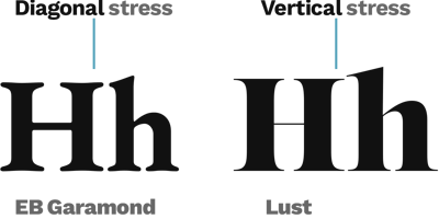
Diagonal stress is most easily spotted in curved letterforms, while vertical stress is apparent comparing vertical and horizontal strokes.
Modern/Didone
Didone and Modern Serif are sometimes used interchangeably to describe the Transitional style taken a few steps further. This high-contrast look excels at conveying sophistication in large headlines but is often a poor choice for body text.
Identifying Modern/Didone compared to other serif fonts:
-
The quintessential "fashion" serif text look
-
High contrast letter strokes with vertical stress
-
Often including the heaviest weight variants
Example: Playfair Display
Key Takeaways
Fonts are an important branding decision that shouldn't be overlooked or left to a default selection. With the broad options available today, a little bit of information and a plan go a long way. Here are some action steps to get you started:
- Define your brand well before looking for fonts
- Build on legibility and readability as cornerstones of your selection process
- Balance uniqueness with familiarity, and avoid making decisions based on trends
- Choose separate fonts for headline and body text to maximize flexibility
- Consider sans-serif and serif fonts separately, and in combination (headline, body)
- Seek trusted opinions from other B2B professionals and experienced designers
Looking for a partner along the way?

Want more? Check out The Complete Guide to Building, Refreshing, and Maintaining a B2B Brand Identity.