

September 22, 2026
Choosing a brand color can be a difficult task. Color choice is often perceived as subjective, so when a rebrand or brand refresh opportunity arises, many default to personal preference or bypass the challenge altogether, upholding the existing brand color. If the complexity of assigning a single color to represent your brand is apparent, then how do you compose a whole set of colors to portray your brand consistently? Is it all just subjective? Is there any “right” or “wrong,” or any objective strategy to selecting a color palette? Let's get into it.
The Brand Identity Process
Picking a color palette, whether you intend it or not, is a defining part of your brand's visual identity. It's articulating something about your brand that's either supporting and harmonizing with your other branding efforts—or it's not.
The best way to build a visual brand identity that's cohesive and communicates successfully is to define your brand holistically. Taking the time to sit down and analyze who you are as a company (purpose, vision, mission, and promise), your audience and their expectations, your competitors and what differentiates you in your market will lay the groundwork for your brand.
All the visual and verbal components of your brand identity rest on this foundation, and a Brand Prism exercise is a great way to build it.
Subjectivity and Arbitrariness
Though color choice has a high degree of subjectivity, it's not arbitrary.
Think about the natural world around you. When the leaves turn from rich green to bright orange, it tells you something about the tree and the climate in which it lives. Skies that are blue and sunny might cause you to open your windows. Dark gray-green skies may have you wishing you put the flashlight back in that kitchen drawer. Most people would not eat a white banana—or use a patch of yellow snow for their snowman.
Whether or not you've pondered this before, we make all kinds of associations with color. Trying to use color arbitrarily, giving no regard to the things certain colors connote, may result in an a very “innovative” palette that no one else seems to appreciate.
This doesn't mean that color associations are static. Like language, it shifts and varies over time and in different contexts (do you remember when the word “literally” used to mean something actually happened?). Individuals and groups of people will always make unique connections with certain colors.
Researching your target audience is key to ensuring your color palette resonates with them.
Research Color in Your Market
The three areas we recommend for research are your competitors, your customers and the broader market in which you operate, and general B2B color trends. If you've conducted a brand identity exercise, you should have a good idea of who your competitors are. Evaluate their brand appearance wherever you can find it (website, social media, printed literature, ads) and take note of their color palettes. Is there a primary color that tends to show up frequently? What other accent and neutral colors do they use?
Some B2B markets are dominated by a very narrow set of colors. For example, in medicine you'll notice a lot of blue. Military markets may feature green or coyote brown. Manufacturing companies often use bold colors like red, orange, and yellow.
What you need to decide is whether you want to stand out in your market or conform. If all of your competitors' logos are blue, is it advantageous to be the one that looks different or falls in line? Again, knowing your target audience is key. In certain markets, tradition, dependability, and risk aversion are key concerns—standing out too much is an easy “X” off their shortlist. In other cases, it's just the opposite, so make sure you know your audience and what matters to them.
A color trend survey is also worthwhile; it's good to be aware of what the larger B2B community is doing with color. Popular color combinations are easy to find with simple web searches, Pinterest, or AI tools and can help you gain inspiration or see what colors to avoid.
A good rule of thumb for B2B: if it feels too trendy, it's probably wise to take a step or two back.
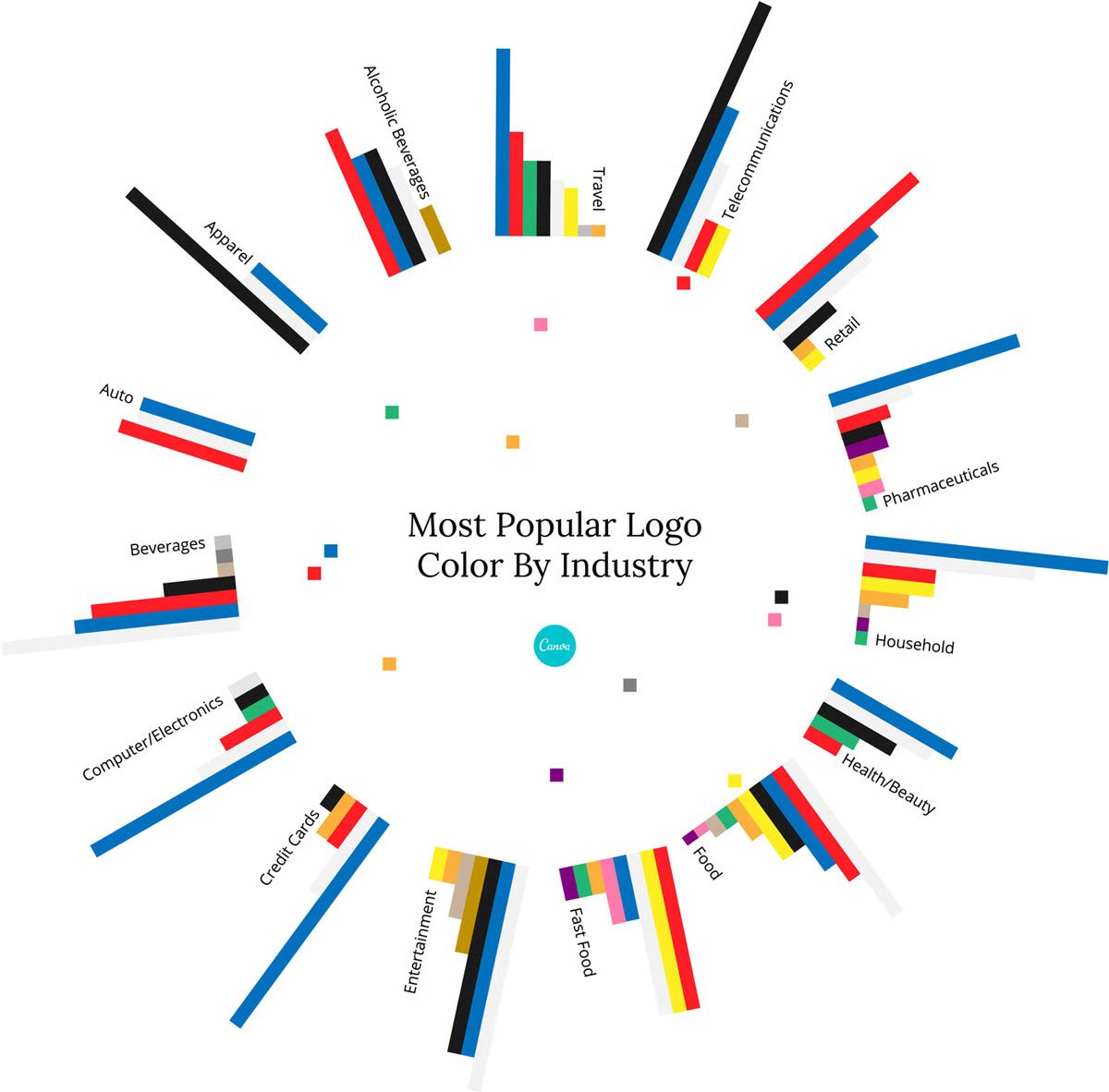
Popular logo colors by industry. Source: Canva.
Color Theory: An Art and a Science
Color can be likened to music: there are observable and repeatable patterns or rules, but sometimes the most distinctive arrangements come from bending those rules. Though much of color study relies on our perception, here are some common color associations:
- Red: love, passion, power, danger
- Orange: youth, energy, vigor
- Yellow: curiosity, optimism, cheer
- Green: tranquility, nature, creativity
- Blue: trust, confidence, security
- Purple: quality, luxury, mystery
- Black: elegance, glamour, authority

Different B2B logos effectively use color to convey core attributes of their brand.
Though there are a number of patterns that can be applied by looking at a color wheel in reference to a base, starting color, a few are particularly helpful for starting a color palette.
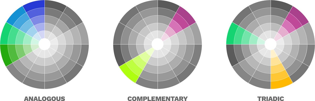
The analogous scheme is composed of colors that are adjacent to each other on the color wheel. Analogous schemes tend to be very mild, safe, and unlikely to offend. Introducing analogous colors can also be helpful to expand a palette, adding a little variation without changing it dramatically.
The complementary scheme consists of colors that are opposite each other on the color wheel. This produces a very high-contrast set, especially when the two colors are similar in brightness and saturation. Taking a color's complementary color and reducing its saturation is a useful method for finding neutral colors.
Finally, the split-complementary or triadic scheme forms an equilateral triangle when viewing the colors on a palette. Starting with one or two of these schemes and varying saturation and brightness is a great way to start building a palette.
Rounding Out Your Palette
Generally, a color palette should have 6–12 colors, often including primary, secondary, and neutral designations. You can assign those designations in the color palette itself or in a secondary document like a style guide. The primary colors are those which your customers will most readily identify with your brand. Your logo colors don't have to be primary colors in the brand palette, but if they are dominant in the logo itself, they are usually considered primary in the palette.
Secondary colors are used less frequently and with smaller design elements to complement the primary colors. If your company serves a variety of markets or offers a number of product lines that fall into distinct categories, secondary colors may be used to organize them. Neutrals are used prominently for text, backgrounds, and large graphic elements.
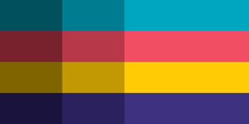
This very bright, working color palette is a great start. This palette could benefit from defining some shades of the brighter colors, a tint of the dark purple, and neutral colors. The palette below is a good example of a more complete palette, with a balance of light and dark colors, as well as neutrals.

Instead of focusing on a certain number of primary, secondary, and neutral colors, start to build out a palette and apply it to a few sample layouts with varying design elements (headings, subheadings, text blocks, pull quotes, images, etc.). This will show you where you have gaps in your palette and how the colors work together. Balancing light and dark colors throughout the palette helps ensure legibility and variety on light and dark backgrounds. Depending on the size of your palette, you may want to create a light or dark version of a given color if it only works well one way.

Sample layouts are a great way to evaluate overall color harmony as well as where your colors work best, informing your usage guidelines.
Formalize it With Documentation
Ideally, each color in your palette will be specified as Pantone (PMS), RGB, and CMYK. Direct conversion from PMS→RGB or PMS→CMYK can be performed in design programs or online, but those conversions often need a bit of manual tweaking. This is especially true if you've got a color that falls outside the CMYK color space. Since CMYK is a smaller color space than RGB, some colors do not reproduce well in both. For example, vibrant, bright purple is notoriously difficult in CMYK.
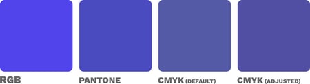
Beginning with a bright RGB value sometimes makes defining a corresponding print color challenging. Note how weak the default CMYK conversion is compared to the original RGB color.
In addition to a simple color palette document, it's a good idea to include it in a style guide. There, you can add more description about when and where to use colors, how frequently, and when not to use them. Focus on providing good guidelines instead of exhaustive rules.
Are your brand colors feeling outdated, or has your palette informally expanded without a clear definition? Consider revising your color palette as part of a brand refresh. Even leaving your primary colors the same, making very slight changes to them, or adding some careful accents and neutrals can make a big difference to update the appearance of your brand.

Want more? Check out The Complete Guide to Building, Refreshing, and Maintaining a B2B Brand Identity.