March 12, 2025
 You’ve probably done it before—clicked an online ad that sent you to a landing page with a form requesting contact information before receiving the promised offer. But how many times did you actually submit your email? Or did you just leave the page, and if so, why? That’s the question we, as marketers, are constantly trying to understand.
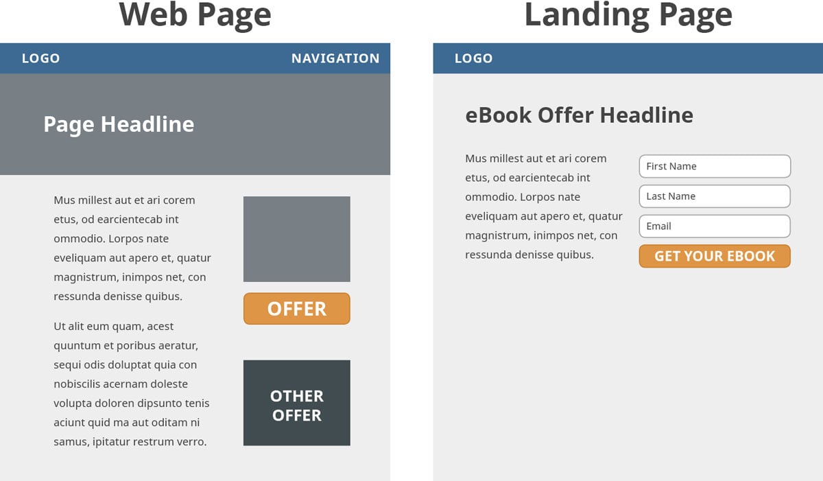
The key difference between a landing page and a web page.
While landing pages are a form of a web page, they have a much different purpose and layout. Landing pages have one intent—converting leads. This typically means getting a user to complete a form with some contact information. Therefore, they should be much simpler than web pages and all distractions such as ads or multiple messages and offers should be eliminated.
If your landing pages are failing to deliver the amount of leads you expected, you’re not alone. Only about 22% of businesses are satisfied with their landing page conversion rates, with an average conversion rate of only 2.35%. And if your page isn’t optimized for conversion, your rate will be much lower.
Here’s a compilation of fundamental do’s and don’ts that will help improve your landing page performance.
Landing Page Don’ts
Don’t have more than one goal.
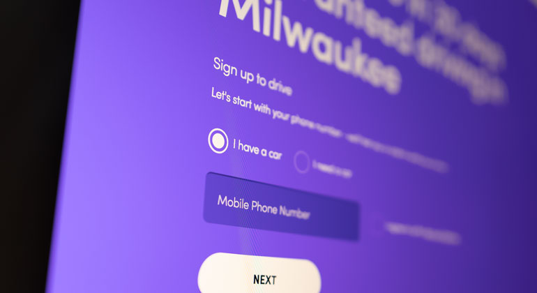
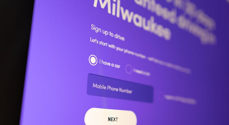
Your landing page should have one offer and form. More than one will distract and confuse the user from your original intent. Be sure your form submit button accurately describes the benefit to the user such as “Download eBook” or “Get My Discount.”
Don’t have a slow loading time.
The average user leaves a page if it takes more than a few seconds to load. Even just a 1-second delay in load time can reduce conversions by 7%.
Don’t have a long form.
Users are hesitant to give out personal information, and typically won’t take the time to fill out a long form. Short forms frequently outperform long forms, so the best practice is to only ask for an email address unless you’re targeting an enterprise client.
Don’t differ ad and landing page copy.
Your ad and landing page copy should complement each other and there should be a clear connection. Disconnections will confuse and frustrate the user.
Don’t have a navigation menu.
When visitors get to your landing page you don’t want any other links visible that could entice them to leave. Removing the navigation menu can increase conversions by 100%!
Don’t crowd the page.
Get rid of any visual clutter or long blocks of copy. Your landing page should be simple and neat. Use contrasting colors and make your form submit button most prominent.
Landing Page Do’s
Do write simple and direct headlines.
Your headlines should be bold and short to grab the user’s attention so they instantly know the advantage of your offer and what they need to do to get it.
Do use images to evoke emotion.
Use visuals to evoke the necessary emotion that encourages your users to take action. For example, use images that show the frustration of the problem you want to help them solve or the desired outcome—such as a frustrated homeowner or a beautifully remodeled bathroom.
Do track visitor behavior.
Use heat map tools to see what your visitors are looking at the most, where they scroll on the page, and what elements they may be trying to click that aren’t actually links.
Do A/B testing of your landing page.
This is crucial to landing page success. Test various layouts, images, headlines, form lengths and submit buttons to see which works best for your target audience. Automated A/B testing tools are ideal for getting accurate and fast results.
Do use scarcity techniques.
When possible, encourage visitors to act now before missing out on your offer—whether that be limited time, quantities, discounts, etc. Including a countdown timer is a great visual way to increase the sense of urgency.
Do include testimonials and trust signals.
Displaying certifications, trusted brand partner logos or including a testimonial will help convert any undecided user.
Do try an exit popup.
An exit popup appears on the screen if a visitor tries to leave your landing page, giving them another opportunity to change their mind.
Following these simple landing page do’s and don’ts will help you convert more users. Remember, always A/B test your landing pages and make updates or changes as necessary!