February 28, 2025
 When it comes to redesigning your website, everything needs to center around user experience. Did you know 42% of people would leave a website because of poor functionality? What’s more 81% of web designers say a low conversion rate is the top reason for redesigning a website.
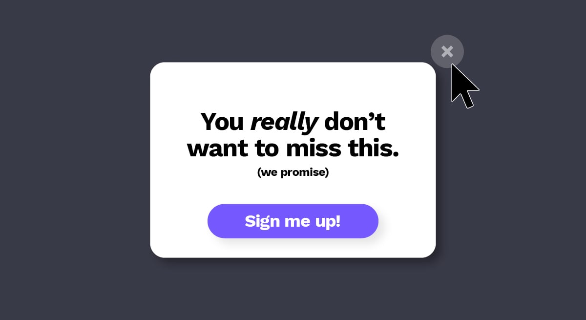
These statistics would imply users either aren’t finding what they need or aren’t compelled to take any action when they do. This could be due to poor usability, a lack of call-to-actions or may be a result of passive messaging that fails to speak to visitors’ specific needs, interests, challenges and desires.
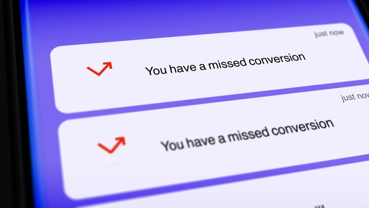
Users drop off quickly if they have a poor experience.
According to a GoodFirms survey, 61.5% of visitors leave a website simply because of bad navigation. How navigable is your website—can users easily find the information they need? Is there a breadcrumb trail that leads to conversion? Improving the usefulness and usability of your website includes both how relevant the content is to viewers, as well as how easy it is for them to find.
Here are some helpful questions to help you evaluate if a redesign is needed:
- Is your story being told effectively throughout the site? What needs to be added and removed? Do products/services need to be better explained?
- Are there product innovations or enhancements you need to make better known to educate the market and current customers?
- Does your audience need to be educated on what problem you’re solving and/or what your product or service even is?
To ensure UX is kept top of mind, follow these user-centered design principles.
Get to understand your users.
Step into your audience’s shoes and experience your website from their perspective. From the start of the project, perform research such as conducting surveys or brief interviews so you can truly solve for the user at every step. This will help identify what’s missing and what could be improved to avoid having to overhaul the whole design later.
Align user needs with business objectives.
Designing for users doesn’t take priority over business objectives. It’s all about finding the right balance and ensuring both needs are adequately met. That means identifying the best way to tell your story and the easiest way for users to discover and learn about it on their own time.
Embrace growth-driven design.
It often won’t be feasible or even reasonable to fix everything at once. Every website is a work in progress. Circumstances change and user preferences are always evolving. Design a website that enables room for growth and continual improvements—no matter how small.
When redesigning a website, these are good objectives to keep in mind:
- Quickly communicate value propositions on the home page
- Develop UX strategy so users know exactly where to go, with minimal effort
- Incorporate messages for key target audiences
- Expand on unique selling points that differentiate you from competitors
- Optimize site for lead conversion (e.g. CTAs, gated content, landing pages)
- Position your brand as a thought-leader and industry expert by blogging and offering both gated and non-gated materials
MortgageCoach.com Case Study
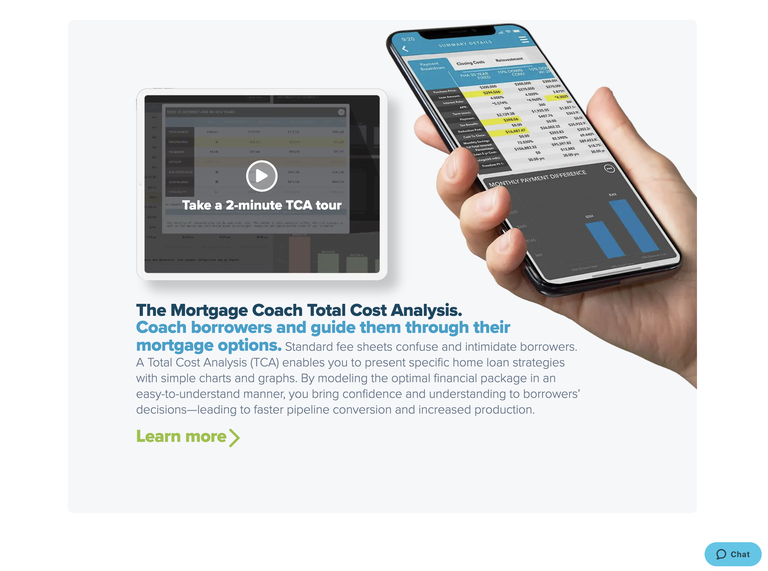
Mortgage Coach redesigned its website to better showcase and communicate its innovative Total Cost Analysis (TCA) solution. The TCA enables mortgage lenders to present personalized mortgage options to borrowers and explain short- and long-term implications with simple charts and graphs, instead of confusing rate sheets. This financial modeling brings confidence and understanding to borrower decisions which leads to faster pipeline conversion, reduced drop-off, increased production, and a better referral business.
Optimizing for user experience.
The new site features a clean design with visuals that reflect the human, personalized approach that Mortgage Coach helps lenders bring to their borrowers. Copy simplifies complex concepts, and the navigation immediately reveals what sets Mortgage Coach apart—the unique “Coach Approach.” Lenders, real estate professionals and homeowners can easily discover how Mortgage Coach solves their specific challenges.
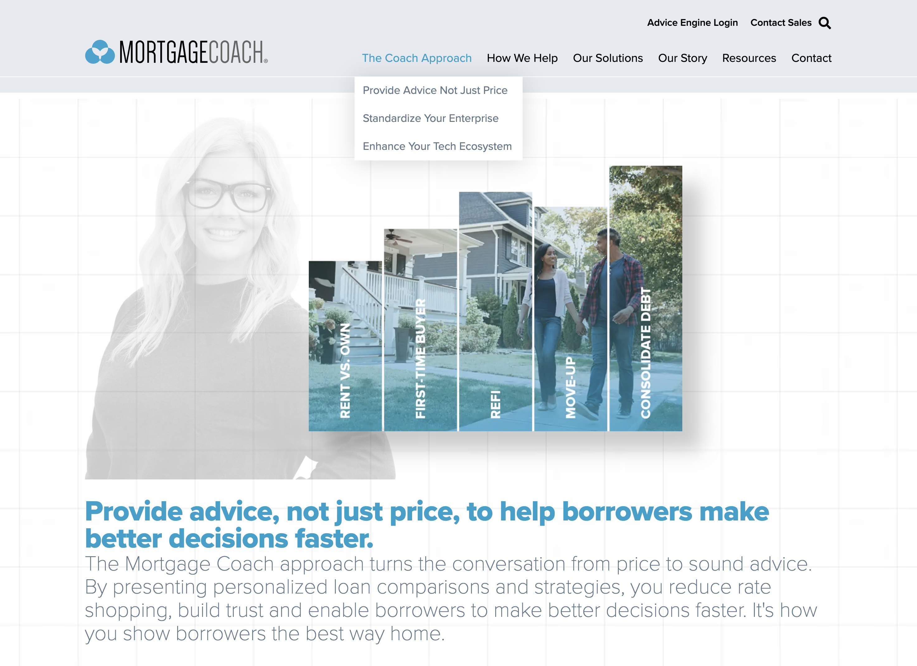
Bringing awareness and understanding to a unique solution.
Mortgage Coach needed to grow industry awareness and understanding of its innovative TCA solution for lenders, borrowers and real estate agents. They created a long-format educational page—Provide Advice Not Just Price—to explain the need for a TCA and the different pain points it solves. Anchor links enabled users to quickly access relevant sections.
Using video to pique interest.
Users are invited to take a quick 2-minute TCA tour, where Mortgage Coach CEO and Co-founder, Dave Savage, walks viewers through the platform’s interface, explaining benefits and use cases. The video provides further insight into what the technology can do and encourages users to take the next step and learn more.
Start improving website usability today.
Does your website enable visitors to experience information in the manner they prefer? Engage visitors better with a website that brings clarity to your offerings, encourages interaction and sends them to your inbox. We’d be more than happy to explore what a website redesign could do for your business.