
August 26, 2020

We’re in uncharted territory now. All of us. Employees working from home. Businesses closed. In-person events cancelled. As marketers meander the mess, the only consistent experience seems to be the web—the one place that’s still open.
Your website is the key platform for brand representation and lead generation. It’s the north star to which all digital communications point. To succeed today your online presence has to work harder and smarter than ever before.
Start small.
As companies look for ways to sharpen their web presence, it’s easy to become overwhelmed. Well, here’s some advice—think big but start small. The most important thing to keep in mind is growth-driven design—the continuous realigning of a project, most typically a website, to help evolve your business as circumstances change. As long as your design enables room for growth, even small improvements working toward a plan are meaningful. Evaluate what needs to be done first and build out a plan of action from there.
Realigning your site to create a better user experience.
A positive or negative experience with your site shapes a user’s perception. How user-friendly is your website? Can visitors find what they’re looking for quickly or do they leave frustrated? Navigation, messaging and CTAs should lead users on a journey towards conversion. When user experiences are optimized, visitor time on the site increases and more attracted buyers convert and close.
Evaluate the navigation.
A website that’s difficult to navigate results in poor engagement and high bounce rates. How effective is your site’s navigation? Start by studying user behavior on your site (e.g. which pages have high bounce rates, where visitors originate from, etc.) and map out your customer’s journey to see how UX can be optimized.
We help clients do this by comparing a sitemap of current site architecture with improved navigation options based on an analysis of various factors including personas, buyer journeys, SEO, and what competitors do or don’t do well. We dig into whether the navigation aligns with the client’s business today and how we can best plan for future expansion of products, services and other helpful resources. How navigation functions on desktop and mobile devices is critical to the experience.
Wireframes prove the pathway.
After mapping navigation, wireframes of key pages ensure the information is presented in the order that will make the most impact—before you dive into development. This typically includes key template pages and those with more challenging navigation pathways. At this stage, content can truly be evaluated on what needs to be added, removed or revised.
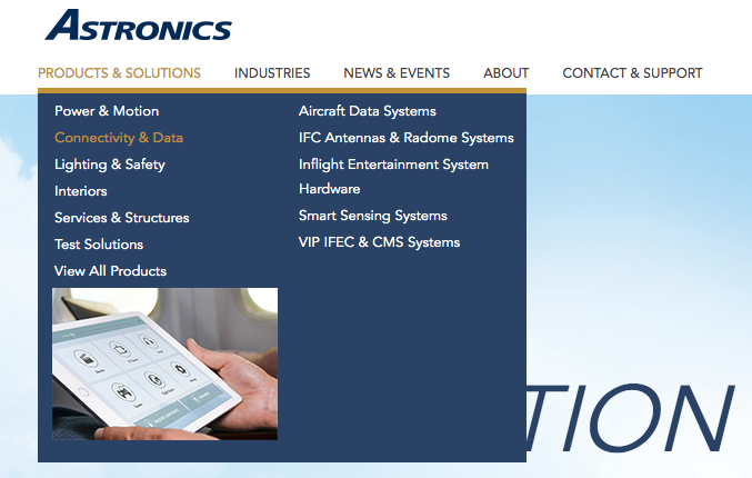
Case in point—Astronics
Astronics turned to MZ to architect a stronger navigation scheme. The complexity of its product offering required rethinking the hierarchy of product groups, product lines and specific products. The goal was to improve the user experience by minimizing clicks to get to the right content. The assignment included the redesign of the main menu and navigation, Product & Solutions Selection page, Product Line pages and Product page.
Using sitemaps and wireframes we strategized a variety of navigation options. The result—executed with the help of their development team—is a menu that enables users to easily drill down to the solution they’re seeking with convenient flyout menus. Paired with consistent widths and functionality throughout, the new main menu dramatically improves the user experience.
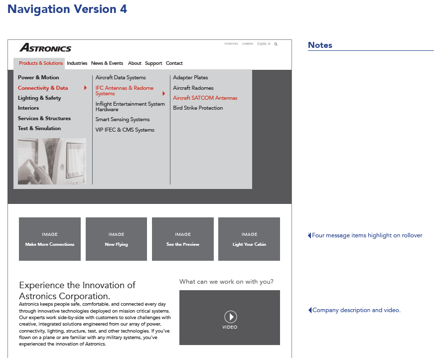
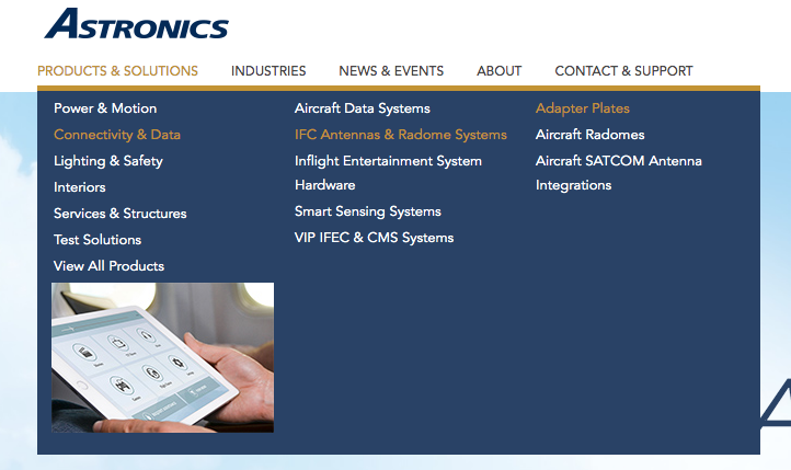
Wireframe of final navigation design
Solutions fly out as the user selects their desired option
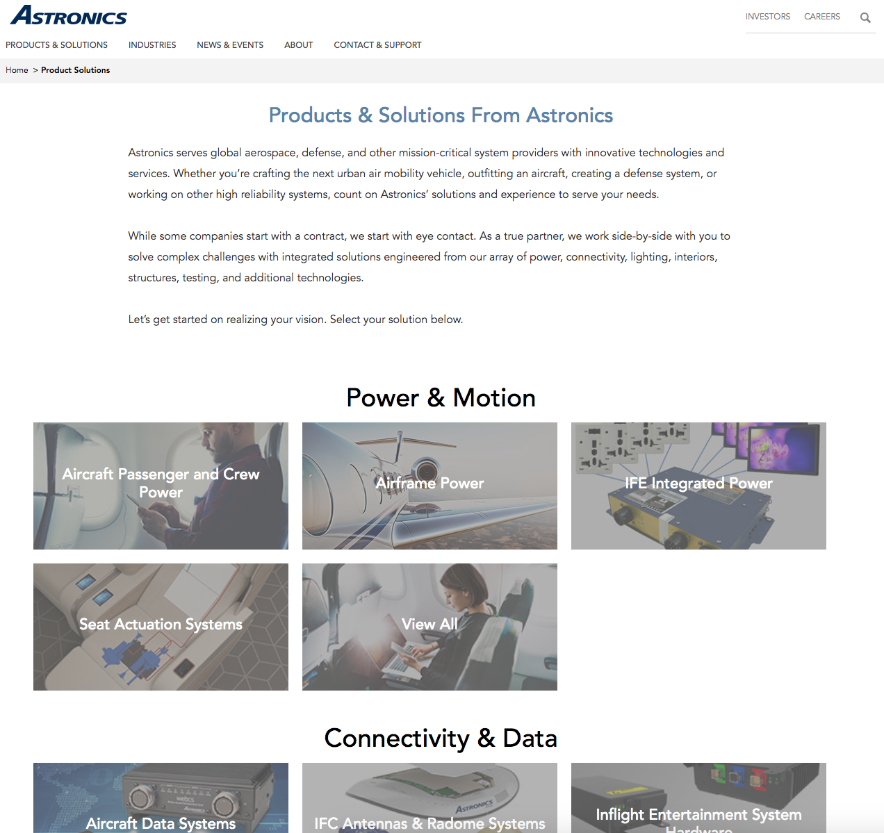
The new Products & Solutions selection page provides users a well-organized view of all options so they can quickly select without confusion. Aesthetically, the design reflects the innovative nature of the Astronics brand.
"MZ helped us refresh our entire brand look and feel, so they were the natural selection when it came time to redesign our website. MZ innately understands companies like ours, with 30+ product lines across 10+ subsidiaries. Very quickly they helped develop a user-first navigation scheme for quick understanding and easy product access. Additionally, MZ provided a complete wireframe and design solution that met our goals of converting website interest to leads, improving our neuromarketing approach with quick-scan copy, and other strategic objectives."
Michelle Manson
Director, Corporate Marketing and Communications
Astronics Corporation
These days, your website is the one place customers can still visit!
Make it worth their while. It’s never been more important to increase visitor engagement and provide a positive brand experience. Growth-driven design will get you there and requires a mindset for continuous improvement. Changes will always have to be made, but every change makes your site better than it was before.
Think big, but start small. And get it going now.
Check out our next blog post for a guide to a complete website redesign.