Web Design: 6 Ways to Increase Visitor Time on Site

May 12, 2020

Did you know 94% of website visitors’ first impressions are design related? The moment someone clicks on your site, you have only a few seconds to grab their attention and convey who you are. And then granted they linger a bit more, how do you get them to follow your desired path?
Increasing visitor time on site begins with a strong visual impression. While great content is necessary to hold their attention, it’s useless if you can’t get them to stay on your site long enough to read it. And how you present that content affects whether they’ll read it.
Here’s 6 web design steps to increase visitor time on site:
1. Have a responsive design
In 2018, 52% of all website traffic worldwide was generated through mobile phones. There’s no question it’s essential to have a responsive design. This means your site should have the ability to be displayed effectively regardless the device or screen size.
"Mobile phone users expect the experience to be seamless. If a website does not function well on a phone or is not intuitive to navigate, very few users will stay—especially if they are new visitors." — Patrick at MZ
2. Optimize site load speed
Slow load times lead to a poor user experience and high bounce rate. After all, 40% of people abandon a website that takes more than 3 seconds to load.
It’s important to note that some images and videos can slow down your website load speed, but this doesn’t mean you should get rid of them. This type of content is highly engaging and increases visitor time on site. Your web design strategy should address how to render this content for a positive user experience, while making it easily-searchable for web crawlers.
3. Map out a logical navigation
With boundless amounts of information on the web, if your visitors can’t find what they’re looking for right away, they’ll try someplace else. This all comes down to navigation. Difficult navigations result in a high bounce rate and poor engagement.
Is your menu too difficult to navigate? Perhaps you have a predetermined path that customers aren’t following. If so, it’s time to make a site map and redo your navigation. Make sure there aren’t too many steps in the conversion process and your call-to-actions are clear and prominent.
4. Build a clean, organized layout
The layout of your website should be well-organized and designed with a visual hierarchy in mind. The color theme should match whatever emotion you’re trying to draw from your target demographic.
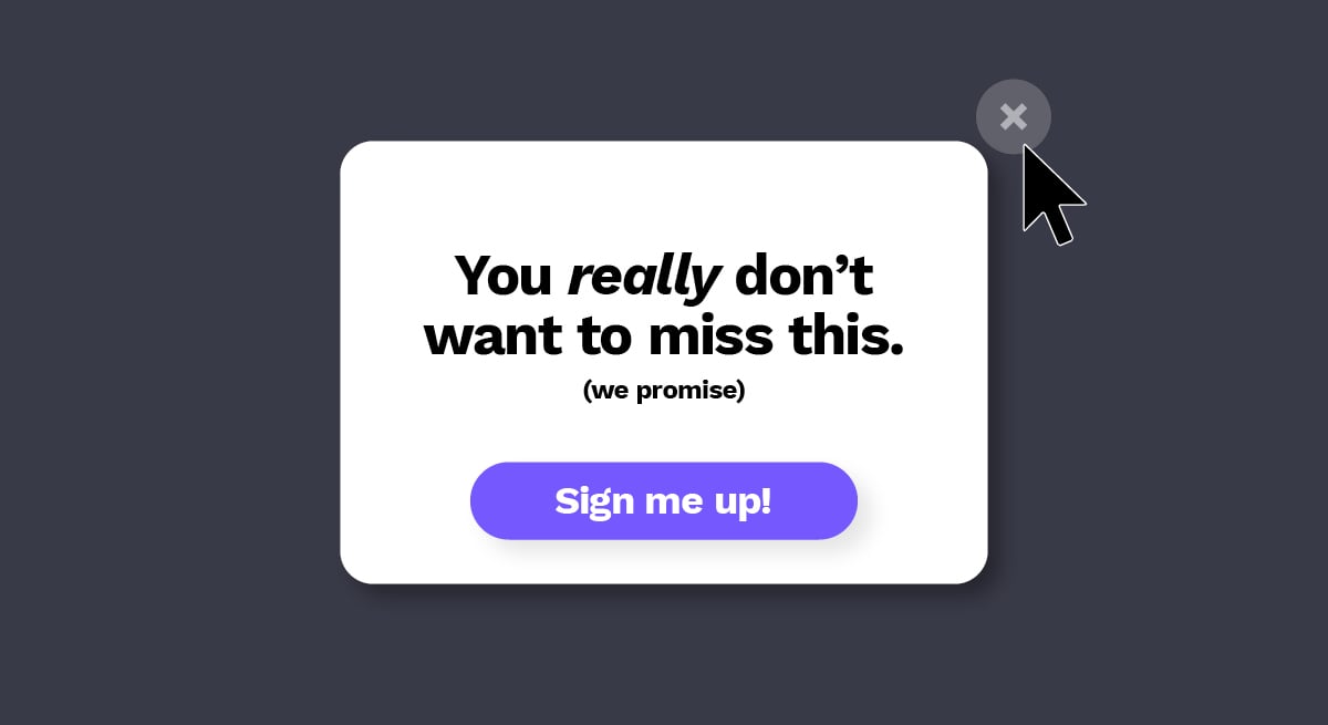
A simplistic homepage broken up horizontally into strips is ideal so the content is clear and digestible. And be careful with pop-ups because too many can result in people leaving your site. The less a viewer has to read or click on, the better they’ll be able to process and evaluate your site’s main message.
5. Design scannable content
Today, 79% of people scan online content instead of actually reading it. This is why it’s critical to create scannable content, and in such a way for users to get the most out of what they do read.
Evaluate the font on your site. Is the typography too difficult to read? Avoid cursive or decorative fonts. And be sure to use capital letters within reason since it takes us longer to recognize words in all-caps vs. sentence case. Then arrange the text using headings, white space, bullet points and images when possible to break up content into shorter segments.
6. Use unique, high-res images
Your images should be fully optimized—from photo compression to selecting what best compliments your copy. It’s better to use your own photography, but unique stock photography can fill in where needed.
"First impressions are huge when it comes to a website. If you can display high-quality, interesting photos to represent your brand, you can immediately position your brand as serious, compelling and worth discovering." — Patrick at MZ
Is your website keeping visitors engaged? Click here to get your free website review from MZ.


