April 22, 2020
“If our branding looks too good they’ll think we spend too much money on marketing.”
We’ve heard the argument before, but it simply isn’t true. A well-designed brand and communications effort demonstrate care, purpose and commitment to your cause. And let’s face it—in our hyper-polished online world, belief in your product or service starts the moment your homepage loads. A low-budget effort might save a few dollars, but could cost you confidence and supporters.
Your brand identity and website are the public face of your organization. And they can make all the difference when it comes to building relationships with donors, broadening your reach and telling your story effectively.
Here are best practice recommendations and an example of how non-profit organizations can create a meaningful identity.
A brand is not a logo.
Your brand is multi-faceted; it’s the tone and manner of your verbal communications, the look of your logo, the mood of your color palette, and the feeling a prospect gets when you’re on the phone or meeting in person. Collectively they elevate your brand. Individually—if not in synch—they can compromise what you seek to achieve.
Building your brand prism.
Working through a brand prism helps identify “for what” your brand stands. We look at the physical, relationship, reflection, personality, culture and self-image of your brand. In this blog, let’s take a look at the physical elements of your brand—specifically identity design.
Why consider redesigning your visual identity.
A strong logo design gives your nonprofit organization credibility, and helps you connect with others. The goal is to build trust—a relationship—and ultimately, financial support.
Many nonprofits may have lacked the resources to create a professional logo from the outset but recognize the need for a redesign when the brand is more established. Other organizations simply wish to freshen the face of their brand to better reflect the evolution of their mission or appeal to a changing demographic.
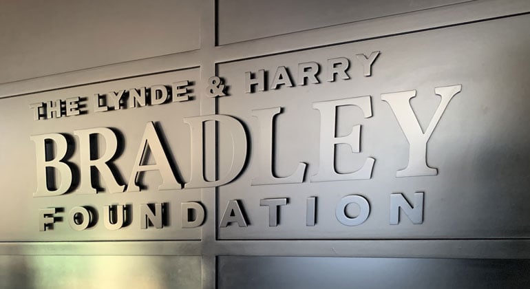
Here’s an example of how MZ used logo design best practices to help refresh the visual identity of The Lynde and Harry Bradley Foundation, a Milwaukee-based foundation with a 35-year legacy of supporting projects and organizations that strengthen families and communities, inform and educate citizens, advance economic growth and encourage self-reliance.
![]()
The Bradley Foundation sought to redesign its logo for a number of reasons:
- Establish a more contemporary look, while retaining the equity of the regal lion icon
- Enable the brand to be better presented in digital and mobile media
- Revive the brand as the foundation took residence in a new office location
Gaining alignment on the icon look and feel.
Our first step in working with The Bradley Foundation was to determine the direction for a refreshed lion icon by comparing and contrasting a selection of logos that utilize the lion theme.
![]()
While all are well done and professional examples of the brands they represent, we used this process to determine the tone and manner for The Bradley Foundation. Our discussion (from left to right) helped determine a visual direction: 1. was too aggressive, 2. too abstract, 3. too detailed and 4. too soft and painterly. Other nonprofit and foundation logos were evaluated as well.
The result.
Throughout the process, logo options were narrowed and refined in a collaborative process with the client team. The result is an icon that demonstrates strength without aggression and a focused, restful readiness.
![]()
The type treatment is balanced, mixing serif and sans-serif fonts for a contemporary take on classic appearances. Overall, the design ensures the logo won’t lose its impact in one color or when reversed, and will work well on various electronic and print media when used large or small. Most important, the new identity will effectively convey the strength and integrity of The Bradley Foundation for decades to come.